
Accessibility at Pavilion
Accessible design enables individuals of varying abilities to engage with, comprehend, and explore our offerings.
It's essential that products and web properties are accessible to everyone, including those with vision, hearing, cognitive, or motor impairments.
Accessible design is a shared responsibility, and involves understanding users' journeys to proactively anticipating their needs. The entire Pavilion team is dedicated to making sure every member (and potential member) is offered the same opportunities.
To ensure products are accessible to all, we adhere to the four principles of the Web Content Accessibility Guidelines:
- Perceivable: It must be perceivable by at least one of a person's senses.
- Operable: All interactions should be operable through various input methods.
- Understandable: Information and interface operation must be clear and easy to grasp.
- Robust: Content should be interpretable by different assistive technologies and able to withstand changes in these technologies.
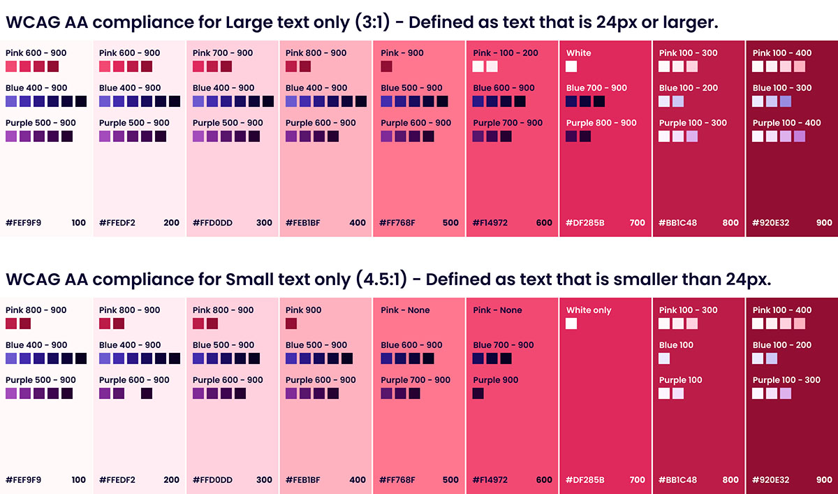
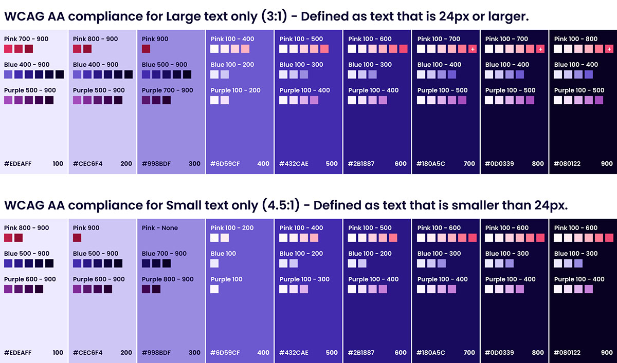
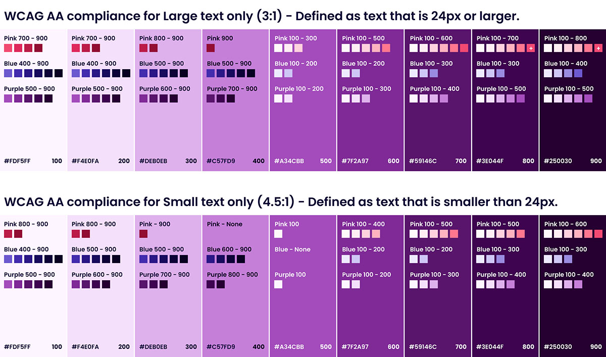
Color
We adhere to WCAG AA standard contrast ratios. While we have a vast color palette, the below table will help add clarity to which colors meet the above contrast requirements.
Note: While the below color combinations all meet accessibility requirements, they do not necessarily meet brand guidelines. For more on color usage, refer to our Brand Colors.
More coming soon.
We are working to incorporate all of our accessibility guidelines very soon.