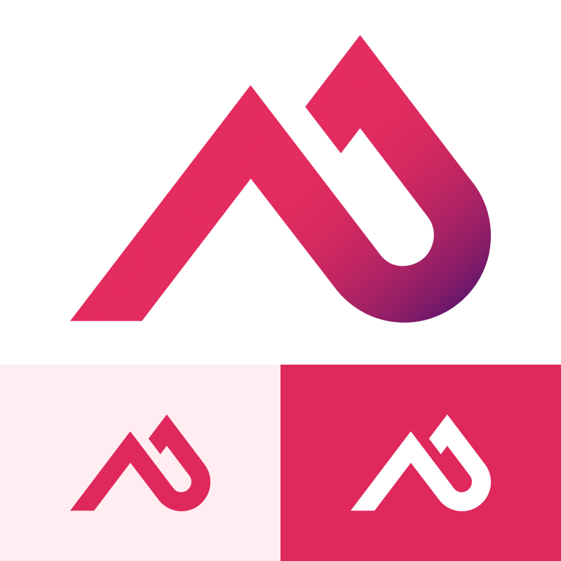
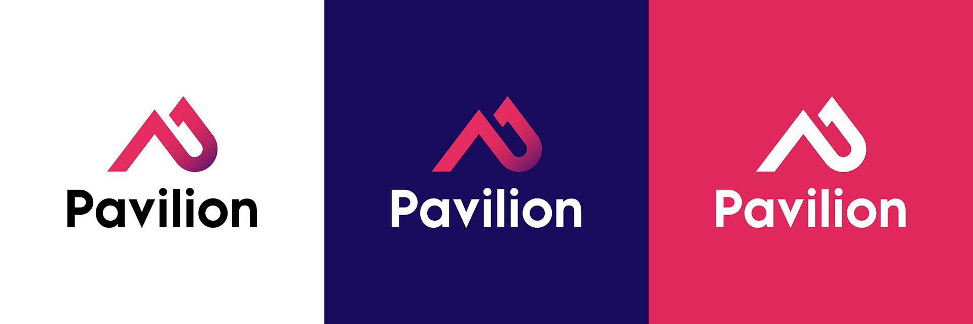
Pavilion Logo

Our logo is a core brand element that should no be altered, edited, or changed in any way. Please use the following guidelines to adhere to proper usage requirements. 

Logo fundamentals

We created our logo to symbolize the very essence of Pavilion and our brand. Below, you'll find a complete guide that outlines these meanings and usage expectations. You can also download our logo to use on co-branded, sponsored, and collateral featuring Pavilion here: Download the Pavilion logo

logo icon

Our brand icon

This icon is a defining part of the Pavilion brand and rooted in symmetry and symbolism. There are three color options that include a gradient, solid pink 700, and white.

Icon angles
icon peak to peak

Full logo

The full logo lockup comes in three main color variations and is designed in a horizontal and stacked format. On white or light color backgrounds, please use the full color logo. On dark backgrounds where color contrast is sufficient, the full color icon with white text can be used. And on any mid tone colors or our pink 700, an all white logo is required.

Note: The stacked format is reserved for rare instances and internal use only. Please request this logo file if needed. 

Logo full color on white
Logo full color on dark colors
Logo full color on pink or mid tones
stacked logo set

Logo usage

When using the Pavilion logo, ensure there is adequate space around the entire mark, the proper contrast is met, and there are no distracting backgrounds causing it to be difficult to render. Below are a few examples of proper usage guides and some examples of what not to do.

Logo full color on pink or mid tones-1
Logo donts

Additional logo guidance 

For any additional questions, please reach out to the Pavilion creative team for assistance.