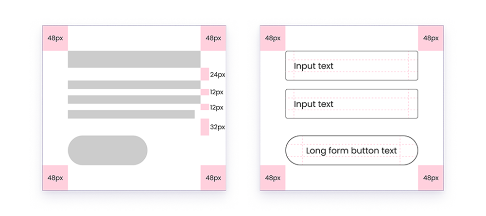
Layout

An essential element of every design, our layout structure is user-friendly and adaptable, offering a wide range of design possibilities.

8px grid system

At the core of our layout structure lies the "Rule of 8's." In essence, we utilize the number eight to establish a framework for text size, spacing, column widths, and more. Within this system, all measurements are divisible by four or eight. This helps eliminate a lot of the guesswork from design, offers structure, and creates a beautiful sense of space through out the brand. Refer to the details below to grasp how this sizing guideline influences our layouts.

rule of 8s examples

The 12 column layout

Much like the above eight pixel system, the twelve column layout allows for a significant amount of flexibility while providing much needed structure. Furthermore, on responsive layouts you can see how our grid breaks down as the screen size shrinks. 

Full layout grid

In practice

When utilizing the above system, it becomes increasingly easy to build full layouts. Remember to start with the smallest component in your design and work out from there. If you have more specific questions, please reach out to the Pavilion creative team.