Icons
Our iconography system is designed to be as flexible as possible, while providing clear structure in the design.
Usage and intent
When using icons in a design, remember to consider the intent. We do not rely on icons alone as this innately leads to a poor user experience, but instead, we pare an icon with text to provide both a visually pleasing and easy to understand experience.
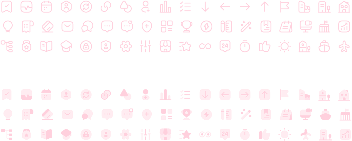
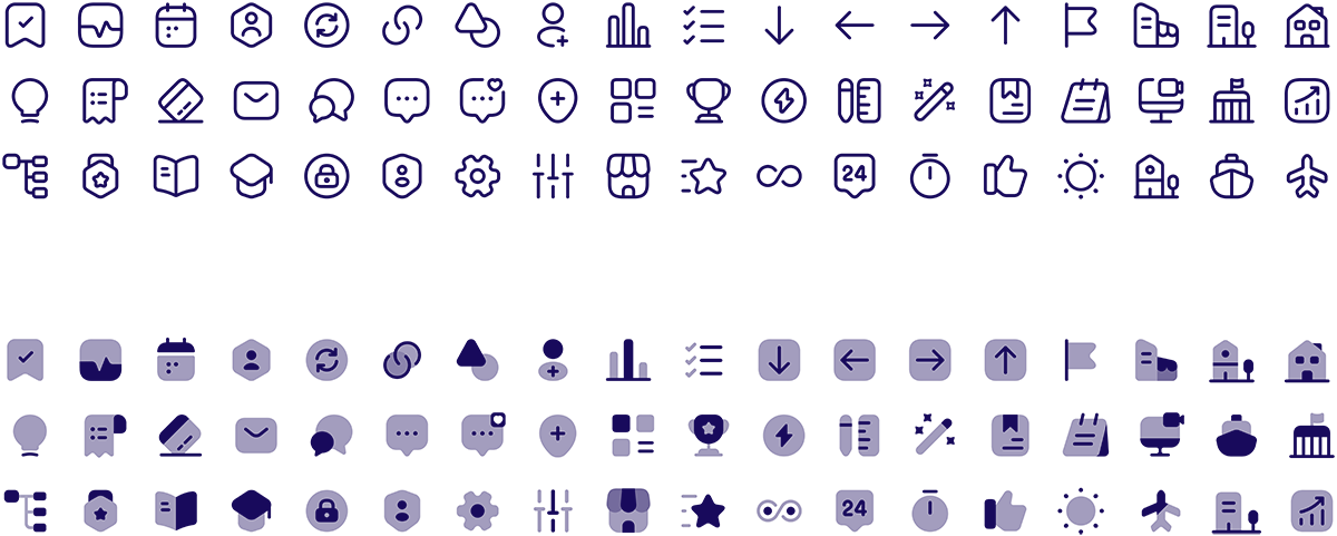
We have two iconographic styles, outlines and shaded. When creating icons, remember to design them in a square in order to keep them consistent with other usages. We also utilize a monoweight line structure with adequate thickness at small sizes to ensure legibility.
Pink icons
Because we don't rely on icons the same way we rely on text from a member experience front, we have lower contrast requirements of 3:1. This allows Pink 700 icons to be used on a wider variety of 100 level and lighter color backgrounds. For more information on background colors and contrast requirements, view our color guidelines.


Icon usage example 1
Aliquam erat volutpat. Ut sapien massa, tempor placerat nunc sit amet, ultricies suscipit elit.

Icon usage example 2
Aliquam erat volutpat. Ut sapien massa, tempor placerat nunc sit amet, ultricies suscipit elit.

Icon usage example 3
Aliquam erat volutpat. Ut sapien massa, tempor placerat nunc sit amet, ultricies suscipit elit.
Light Pink icons
When using dark backgrounds, we don't use pure white icons, but instead, Pink 50. A very light (almost white) option that adds a little extra visual interest. These icons can NOT be used on white or light color backgrounds as they won't provide minimum contrast requirements for accessibility.

Blue icons
These icons are used only when we don't want to call as much visual attention to the icon itself. Pink is a more vibrant color and can draw more visual interest where as blue will blend more with the headline used and draw less visual prominence.

